
Abby Birch
June 2026
Neurodivergent Finance
Logo | Logo Mark | Colour Palette | Fonts | Social Media Templates | Brand Cheat Sheet
About the Client
Abby Birch is a neurodivergent money expert and financial well-being coach who works with both individuals and corporates. Her clients are mostly women — late-diagnosed, neurodivergent, professional — who are carrying the weight of past money mistakes and don't yet know how to move forward. Abby's approach is simple but powerful: meet people where they're at with money, and take the next step together. No budgets forced on people who aren't ready. No one-size-fits-all solutions. Just honest, warm, expert guidance that makes money feel less like a threat and more like something you can actually work with.
Discovery
When Abby came to KLC, she'd been sitting with her brand for nine months. She knew what she wanted to feel - she just couldn't get there on her own. Her previous brand felt too corporate: too cold, and too inconsistent. She'd been building assets piecemeal - LinkedIn, webinars, slides, a directory listing - all with different looks, none of them quite right.
She'd explored a lot of directions. A lighthouse (overused, and it implies your clients are already in crisis — not the message). A birch tree (too obvious). Peacock colours (too elitist). Hearts (personally meaningful, but ChatGPT had made them feel generic). She kept coming back to circles — a quiet nod to coins and money — but couldn't make it land.
The brief was genuinely complex. Abby needed a brand that could walk into a boardroom *and* sit across from someone having their first honest conversation about money. It had to feel warm and expert at the same time — *"a warm hug, but I'm an expert."* And critically, it had to work for a neurodivergent audience: clean lines, no hand-drawn chaos, soft rounded shapes rather than anything jagged or corporate.
She also needed flexibility. As someone who self-describes as getting bored with things (her words: *"as every neurodivergent person goes, I'm bored with my brand"*), the brand had to have room to breathe and evolve — without ever going off-brand.


Design & Development

Abby's rebrand was perfect for Design in a Day — a live, collaborative process where everything gets built, reviewed, and refined in real time. No disappearing for two weeks and coming back with four options she'd have to choose between. Just honest, in-the-moment decision making.
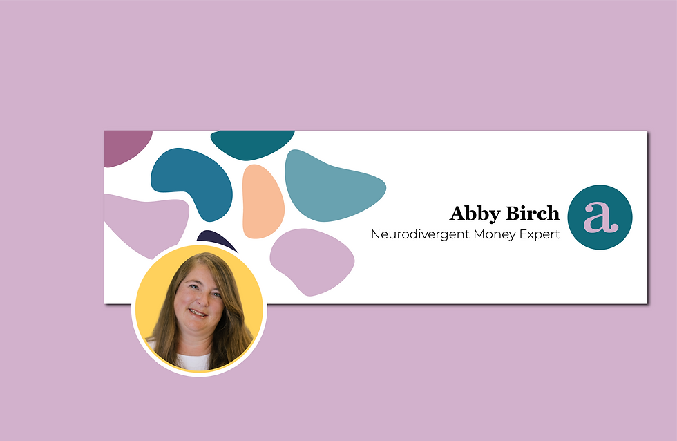
The logo direction centred on Abby's initial — a lower case a in Georgia, a serif font chosen specifically because the tails help neurodivergent readers distinguish letterforms. Clean, warm, and distinctive. Paired with a circle motif that quietly references coins and money without shouting about it, the mark does exactly what Abby needed: it says *expert* without saying *bank*.
The shapes — soft, rounded, fluid — became the backbone of the whole system. They can be coins. They can be speech bubbles. They can be thoughts, puzzles, or pathways. They shift meaning depending on context, which mirrors neurodivergence itself: fluid, flexible, never fixed.
The colour palette was built around a seasonal rotation concept: colours that shift with the seasons, keeping the brand coherent without locking Abby into one mood. Space Indigo, Dusty Lavender, Pink Orchid, Soft Apricot, Pacific Blue, Stormy Teal, and Coral — with lighter and darker gradients giving around 27 usable variants in total. Corporate moments lean into the blues. Personal, individual moments lean into the purples and pinks. And if Abby ever needs to walk into a bank and present? She can pull everything back to indigo and it reads completely differently, without touching a single brand element.
Everything was set up in a Canva brand kit — full colour palette, gradients, font pairings, social templates, and a cheat sheet of colour combinations — so Abby can get going immediately without second-guessing herself.


Result
Abby came in not knowing what she expected. She left with a brand that was, in her words, "chalk and cheese" compared to what she'd had before — and she loved it.
A brand that's timeless, flexible, deeply personal, and unmistakably hers. One that couldn't belong to anyone else — because everything in it connects back to Abby. The colours are rooted in where she lives. The shapes speak to neurodivergence. The A is her. If someone tried to copy it, it simply wouldn't fit them.
She noted something that stuck: "It doesn't look like it's a ChatGPT logo. It looks like it's been designed by a designer." That's the point. This isn't a template. It's a brand built around one person, one story, and one very clear purpose — helping people feel differently about money.